
Introduction
Visualizing data with more than three dimensions presents unique data science and analytics challenges. Traditional plots such as histograms, scatter plots, or bar charts are excellent for one or two variables but quickly become inadequate as dimensionality increases. Yet, much of the real-world data we deal with—especially in domains like healthcare, finance, and deep learning—is inherently high-dimensional. This necessitates sophisticated 3D and 4D visualization techniques that help us interpret, explore, and communicate insights from complex datasets.
This article explores core techniques and tools for visualizing 3D and 4D data, offering a bridge between dimensionality and human perception. Many of these techniques are core topics in a Data Analyst Course, making them fundamental to analytical proficiency.
Why Visualize High-Dimensional Data?
The primary purpose of visualization is to leverage the power of human visual perception to find patterns, correlations, clusters, or anomalies. In high-dimensional data, we often rely on visualization to:
- Understand the structure of the data space
- Identify significant features
- Communicate findings with stakeholders
- Guide model selection or preprocessing steps like feature reduction
For 3D and 4D data, the challenges are twofold: how to represent multiple features within a limited perceptual medium and how to maintain interpretability. These foundational challenges are covered in any well-structured Data Analyst Course, especially during modules on exploratory data analysis and dashboarding.
Foundational Techniques in 3D Visualization
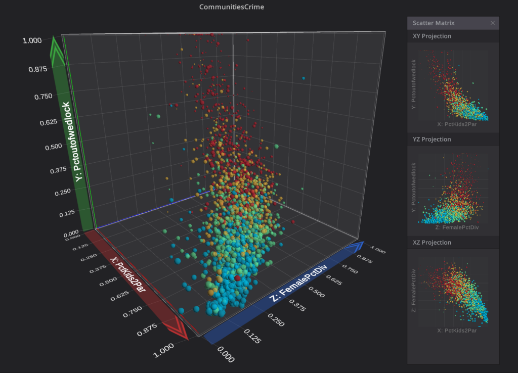
3D Scatter Plots
One of the most direct extensions of 2D plotting, a 3D scatter plot allows mapping three numeric variables to the x, y, and z axes. Python libraries like Plotly, Matplotlib (with mpl_toolkits.mplot3d), and VTK provide 3D plotting capabilities.
Advantages:
- Intuitive for spatial data
- Supports rotation and zooming for better inspection
Limitations:
- Occlusion and overlapping points
- Depth perception issues in static images
Surface and Mesh Plots
When data points form a continuous surface—like in topographic maps or neural activity heatmaps—surface plots can represent value changes over a grid. This is particularly useful in engineering simulations or scientific computing.
Volumetric Rendering
Volumetric rendering visualizes 3D scalar fields, which is common in medical imaging (like MRI) or meteorology. Libraries like VTK, Mayavi, and ParaView allow rendering isosurfaces or slice-based exploration of volumes.
Parallel Coordinates in 3D
A variation of parallel coordinates places axes in 3D space, enabling slightly more clarity than traditional 2D forms. It works better when integrated with interactivity, allowing users to filter or brush subsets.
Understanding the “Fourth Dimension” in Visualization
The fourth dimension is often temporal, categorical, or another quantitative variable. Since we cannot perceive 4D directly, we map the fourth variable to visual properties like:
- Colour
- Size
- Transparency
- Animation (for time series)
- Motion paths or traces
Thus, 4D visualization is not about drawing in literal four dimensions but encoding the extra variable through visual metaphors. Students learning these concepts in a Data Analyst Course often experiment with these encoding methods in capstone projects involving real-world datasets.
Techniques for 4D Visualization
Color-Coding and Size Mapping
A fourth variable is often represented using colour gradients (e.g., temperature or density) or point size variations (e.g., magnitude or frequency). In a 3D scatter plot, this makes the plot richer without adding clutter.
Time as Animation
Time is frequently used as the fourth dimension in dynamic visualizations. A series of 3D plots updated over time—via sliders or animations—can show evolution or trends.
Examples include:
- Tracking particle movement in fluid simulations
- Evolution of clusters in training neural networks
- Motion capture data in biomechanics
Interactive Visualization
Interactivity is crucial for exploring 4D data. Using tools like Plotly Dash, Tableau, or Power BI, one can filter by categories, animate changes, and toggle dimensions. Interactivity helps overcome the limitations of static plots and enables exploration from multiple perspectives.
Glyph-Based Visualization
Each data point is visualized using glyphs (e.g., arrows, cones, or icons), where shape, orientation, and size encode additional dimensions. This is especially common in vector field visualization and wind or fluid flow studies.
Dimensionality Reduction for Enhanced Visualization
When dimensions exceed four, the visual overload becomes significant. Dimensionality reduction techniques come into play, projecting high-dimensional data into 3D or 2D spaces while preserving structure:
Principal Component Analysis (PCA)
- Linear technique that reduces dimensionality by preserving variance
- Works well for globally linear data
- PCA outputs are often visualized in 2D or 3D scatter plots
t-SNE (t-distributed Stochastic Neighbour Embedding)
- Non-linear technique good for clustering and local structure
- Commonly used to visualize embeddings from NLP or image data
- Best suited for 2D, though, it can be extended to 3D with care
UMAP (Uniform Manifold Approximation and Projection)
- Preserves both global and local structures better than t-SNE
- Scales well with large datasets
Effective for 3D plots and interactive projections
A good data course, for instance, a Data Analyst Course in Pune often includes hands-on exposure to these techniques using datasets from e-commerce, healthcare, or finance domains.
Tools and Libraries for 3D/4D Visualization
Here are some powerful tools data scientists and analysts can use:
- Matplotlib + mpl_toolkits.mplot3d: Basic 3D support
- Plotly: Interactive 3D plotting with support for colour, size, and animation
- Mayavi: High-level 3D scientific visualization, suitable for volume rendering
- VTK/ParaView: Advanced rendering for large scientific datasets
- Power BI / Tableau: Business-focused dashboards with limited 3D but powerful interactivity
- Three.js (JavaScript): Web-based 3D rendering
- Blender/PyVista: For artistic or more immersive rendering needs
Challenges in 3D and 4D Visualization
Despite the power of these tools, several challenges persist:
- Occlusion: In 3D, data points can hide others
- Perception Limits: Human eyes struggle with depth and simultaneous variables
- Overplotting: Too many points make it cluttered
- Interpretability: Complex visuals may confuse non-technical audiences
- Performance: High-dimensional data can be computationally expensive to render
Mitigating these challenges requires thoughtful design, interactivity, and, when necessary, hybrid approaches like combining 3D plots with summaries or filtering. These problem-solving techniques are integral to assignments in an advanced Data Analytics Course.
Best Practices for Effective Multidimensional Visualization
- Use animation sparingly to encode time or change
- Leverage interactivity—users should rotate, zoom, and filter data
- Apply dimensionality reduction if raw 4D plotting isn’t feasible
- Use clear legends and annotations to decode visual metaphors
- Avoid visual overload—less is often more
Conclusion
Visualizing 3D and 4D data is not just a technical necessity but an art that blends science with perception. As datasets grow in complexity and volume, mastering high-dimensional visualization becomes critical for exploratory data analysis, model interpretation, and stakeholder communication. Whether you are interpreting latent embeddings from a neural network or exploring geospatial-temporal trends, these visualization techniques can bring clarity to complexity—turning numbers into narratives and dimensions into discoveries.
For anyone serious about entering the field or upskilling, enrolling in a good data course in a reputed learning centre, such as a Data Analysis Course in Pune, offers the theoretical grounding and practical exposure needed to master these multidimensional techniques.
Business Name: ExcelR – Data Science, Data Analytics Course Training in Pune
Address: 101 A ,1st Floor, Siddh Icon, Baner Rd, opposite Lane To Royal Enfield Showroom, beside Asian Box Restaurant, Baner, Pune, Maharashtra 411045
Phone Number: 098809 13504
Email Id: enquiry@excelr.com